Understanding the Common Commercial Palette
Finding the right color palette for a commercial space can be daunting. You want to select a color scheme that's easy on the eyes, aesthetically pleasing, and minimizes distractions. Most importantly, the color palette should compliment the type of business you run. For commercial spaces, especially those used for retail purposes, the color scheme can make a huge difference in attracting customers and increasing sales. This blog post aims to provide insight into the common commercial palette to help you make an informed decision.
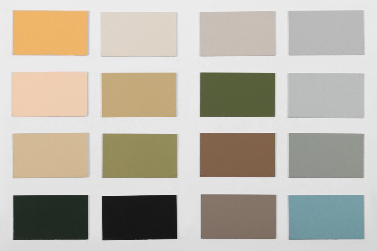
Neutral Colors
Neutral colors include beige, gray, white, and black. These colors are often used in offices, hospitals, and retail spaces. They convey a sense of calmness, security, and professionalism. Neutral colors also act as a perfect backdrop for accent colors and help highlight products and displays.
White
White can be overpowering if used excessively in a commercial space. However, when used appropriately, it can give a sense of cleanliness, sophistication, and purity. White can help make a small room look more spacious and is perfect for environments that require a calm and inviting atmosphere.
Blue
The color blue is known for its calming properties. It's a popular color in the healthcare industry, where a calming environment is essential. Blue can also be used in retail spaces, especially in stores that sell products related to water, sky, or travel. Dark blue hues convey stability, authority, and intelligence, while light blues reflect reliability, calmness, and clarity.
Green
Green is an ideal color for businesses that promote eco-friendliness or sustainability. It's also an excellent choice for offices where creativity is the key to success. Green comes in many shades, and each shade has its unique properties. Dark shades of green communicate wealth, while lighter shades convey optimism, growth, and renewal of energy.
Yellow
Yellow is a warm and vibrant color that can evoke happiness and energy. It's perfect for businesses that want to grab customer attention. Yellow can be used in playful and optimistic brands that sell toys, sweets, or cosmetics.
Red
Bold and bright, red is often used to evoke energy and passion in commercial settings. It’s both stimulating and exciting, making it perfect for bars, restaurants or small retail spaces. Notably, in Chinese culture, red represents good luck and happiness, so it’s a popular color for Chinese restaurants and businesses.
Conclusion
While this guide provides an overview of the common commercial color palettes, it's essential to understand that colors have a psychological and emotional impact on people. It is best to consult with a professional painter before you make a final decision on your commercial space's color scheme. At Lakestone Painting, we offer a free consultation to help you make an informed choice. Our professional painters in Orlando, FL, are experienced in commercial painting and will work with you to create a color scheme that will help achieve your business goals. Contact us today, and let's get started on creating an unforgettable commercial space.