The Power of Contrasts: A Guide to Using Commercial Paint Colors

In today's world, it's essential to attract potential customers to your business with eye-catching visual elements. One of the most effective ways to do this is to use contrasts in your commercial paint colors. Contrasts not only catch the attention of potential customers but also create a dynamic, energizing ambiance for your business. In this guide, we will show you how to use contrasts in commercial paint colors to enhance your business's aesthetics and attract more customers.
1. Complementary Colors
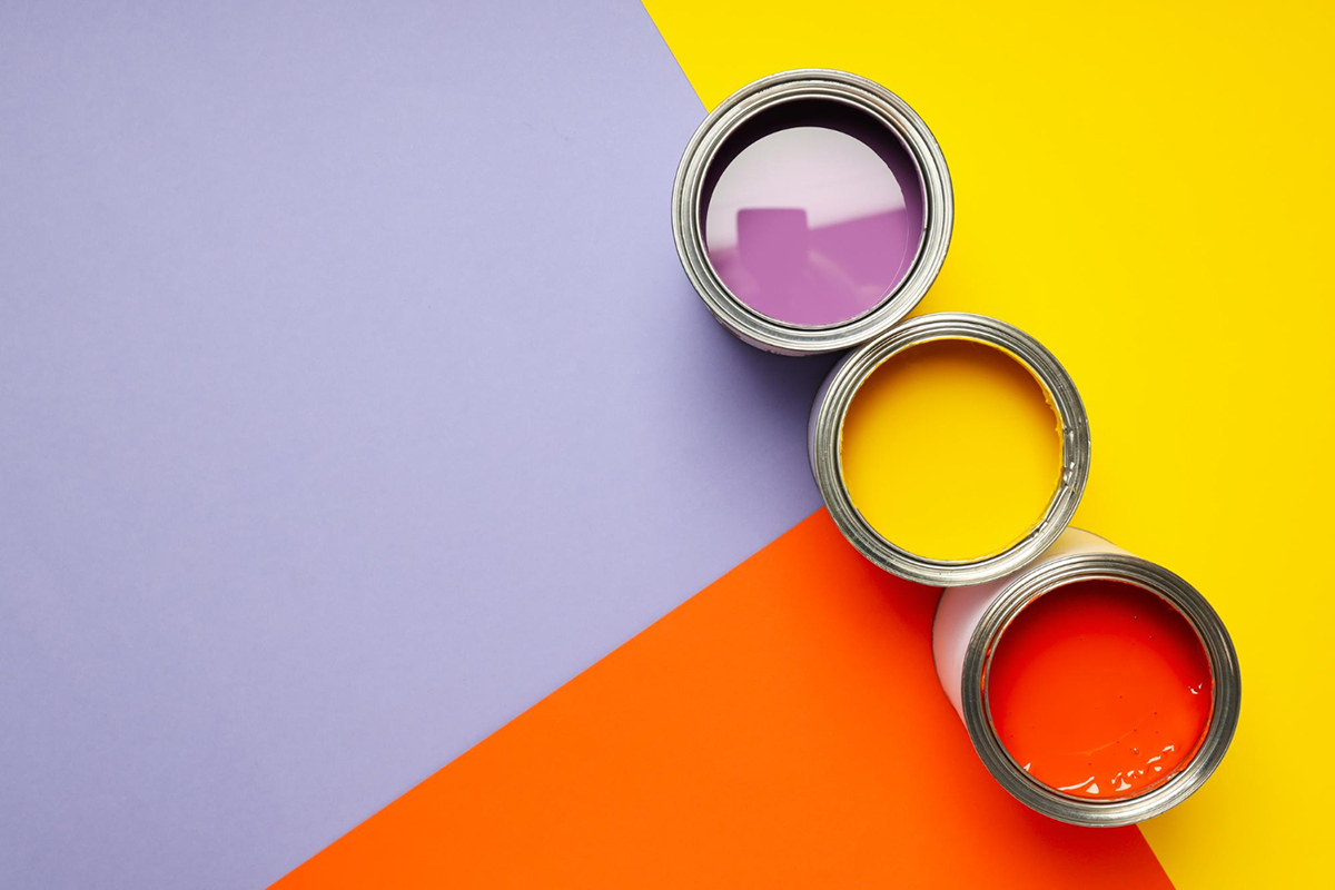
Complementary colors are opposite each other on the color wheel and create a striking contrast when used together. For example, blue and orange or purple and yellow are complementary colors. You can use these contrasting colors to create an energetic and bold statement in your commercial space. Orange accents on a blue wall or yellow pattern on a purple backdrop add a burst of vitality and personality to any business.
2. Monochromatic Combinations
Contrasting monochromatic colors, or variations of one color, creates a subtler, yet sophisticated mood. Using different shades of the same color or adding white or black as contrast creates depth and elegance. For example, an all-white room can feel sterile and uninviting, but adding gray, black, or navy hues will create a chic, modern, and cozy ambiance.
3. Warm and Cold Colors
Warm and cold colors are natural contrasts, and they can create a sense of balance when used together. Warm colors like red, orange, and yellow create an energetic vibe, while cold colors such as blue, green, and purple create a calming atmosphere. It's essential to choose the right balance and use warm and cold hues in ways that complement each other. For example, picture a white brick wall with green ivy leaves crawling up the side: it makes an inviting and peaceful backdrop.
4. Bold Patterns
Using patterns is a bold and commonly overlooked way to create contrasting elements in your commercial space. Mixing patterns and contrasting colors can add a playful and dynamic effect. Geometric patterns, stripes, and polka dots work exceptionally well in commercial spaces because they are precise and visually appealing. Mosaic, tribal, and floral patterns are also effective if your business has an artistry and creative component.
5. Effect of Light
Light plays a big role in creating contrasting effects in commercial spaces as well. Lighting fixtures that contrast your paint colors can enhance your space and work wonders in creating dramatic effects. For example, complementing bright yellow or orange color with dimmed, warm light can create a cozy and inviting atmosphere. On the other hand, blue, green, or purple are ideal counterparts to cold and bright lighting fixtures.
Conclusion
In conclusion, using contrasts in commercial paint colors is an art and science, with the aim of creating a pleasant and fitting ambience in your business. It's essential to choose the right combinations and balance to achieve the desired effect. Every commercial space has its unique personality and style, and the use of contrasts in color can create the right atmosphere that represents your business. Being a renowned commercial painting company in Orlando, FL, Lakestone Painting is committed to providing superior painting services to businesses in the area. If you're looking for Painters in Orlando, FL, don’t hesitate to contact us today for a free consultation and let us create the perfect ambiance for your business with contrasting color effects.